Business
4 common banner design mistakes to avoid
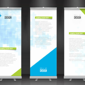
Banners are a form of promotion strategy that combines text and images for marketing and generating new leads for a brand. One can design banners for various companies focusing on brand promotion, awareness creation, etc., depending on the type of business. Creative designs and well-written copies play a huge role in improving the buzz for any brand. Here are a few mistakes to avoid while designing a new banner for any print or digital campaign. Poor color combinations Color shades make or break your banner designs and can mean all the difference between running a successful ad campaign and losing out on marketing opportunities. Color psychology is a study of how various colors affect human behavior and mood that marketers use to create a good advertisement, irrespective of print or digital. The type of product or service offered by the client can significantly impact the color of banners. Picking the wrong size for banner elements For both print and digital banners, it is important not to mess up the size of the elements used for the banner. For example, a bigger font with limited space on the banner will make the whole copy look disproportionate and unappealing. Spacing is also important, depending on the font you choose.


